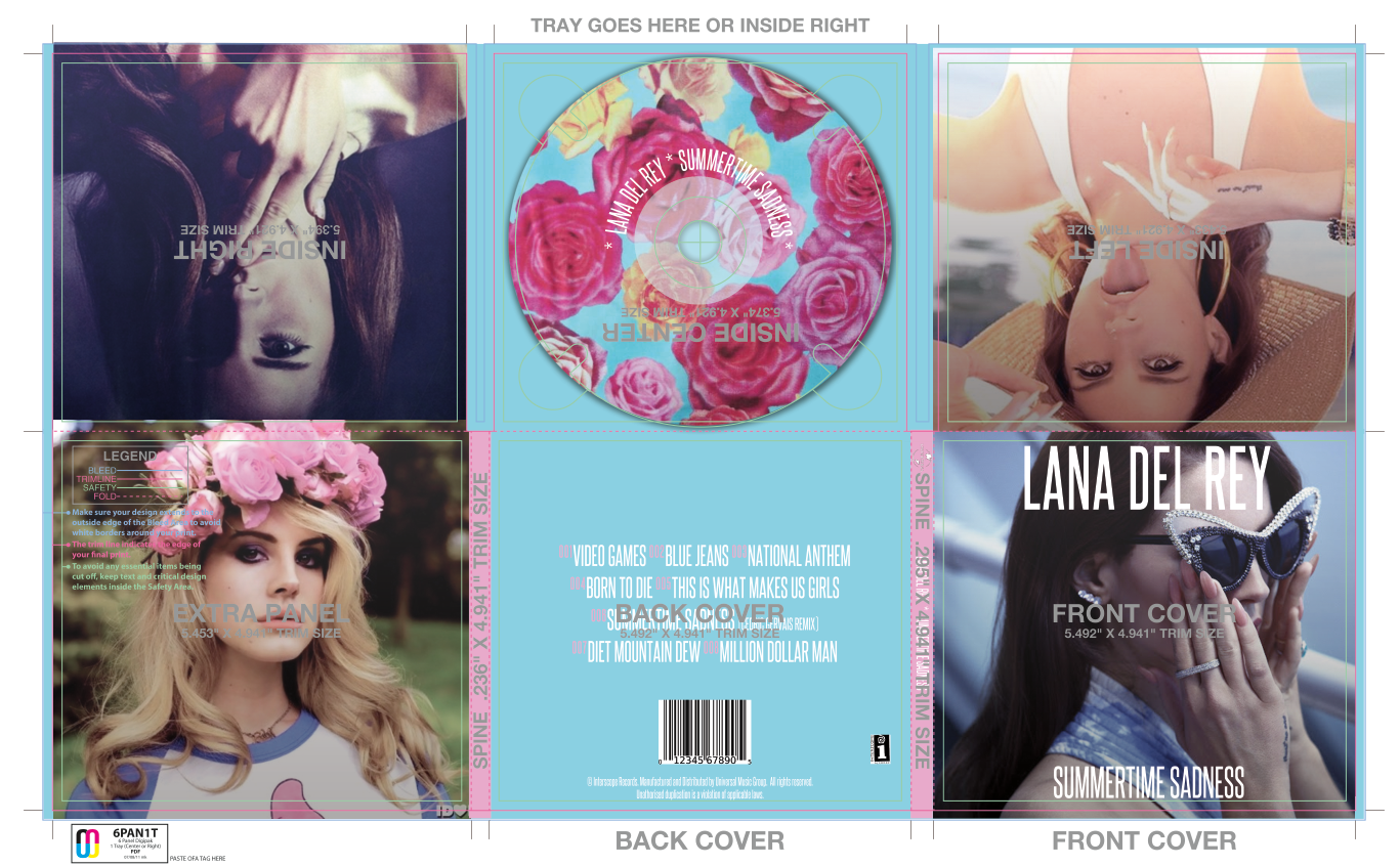

Before I made my actual digipak, I wanted to practice creating one first. Above is my first try at a digipak. The first image is the product with the guidlines still in place, the second image is what the digipak would look like printed out.
For this practice I did a Google search for Lana Del Rey digipaks and tried to conform to some of what I found, i.e.:
- a barcode
- a copyright infringement
- the record label's logo
- Lana Del Rey's signature font
- the use of strong, determined poses
Three out of four of the photographs I used feature Lana Del Rey giving off a strong direct gaze to the camera, although the cover image I used features Del Rey looking away with sunglasses covering her eyes which is very unconventional for her. My reason for doing this is because I didn't want to conform to all the conventions, although I did still want to make it apparent that it's the same old Lana Del Rey that everybody is used to which is shown through the other four photographs.
A barcode is essential so that the digipak can actually be purchased, as well as the record label and the distributor's logo so that people recognise who created the album.
I used soft, pastel colours as these are the sort of colours most associated with Del Rey. I chose a floral pattern for the CD because flower crowns are another part of Del Rey's signature look, so it gives the album a more personal feeling because it seems as though it's identifying with the artist.
The layout of the track names is also quite conventional of Del Rey's CDs, but I think it works effectively so I didn't want to change this.
No comments:
Post a Comment