
This is the first advertisement that I created. I decided to include one of the bokeh photographs as an overlay to make the image look more unique and I included conventional features such as star ratings from music magazines and Becca Del Rose's website.
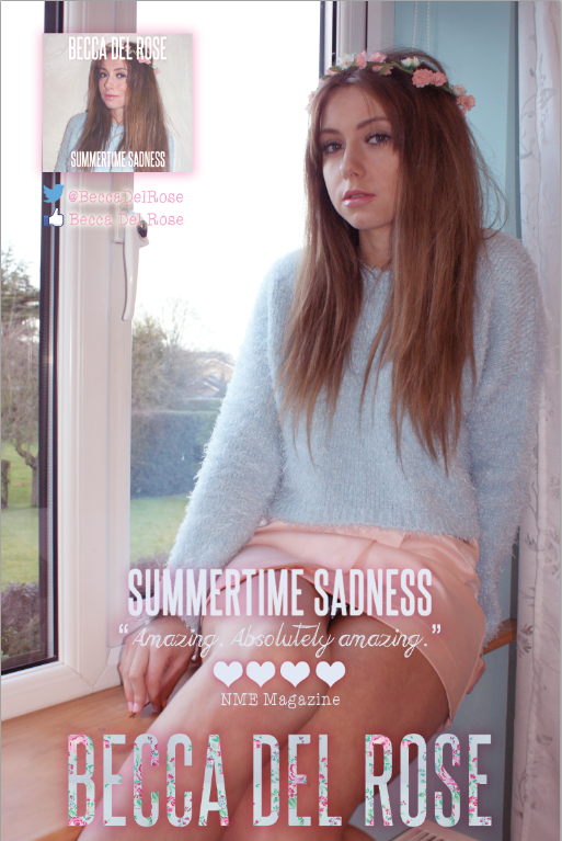
After I created the first advertisement, I decided it perhaps wasn't a good idea having the main image the same as the one I used for the digipak as it didn't showcase my skills enough. Therefore, I created another advertisement using a different photograph. However, I didn't think this photograph looked professional enough because of the plastic white windowframe, although I did like the unconventional use of hearts instead of stars for the magazine rating and the comment.

This is my third (unfinished at the minute) magazine advert. I decided to try and combine the two previous magazine adverts so that I would potentially create a mix that looks professional. I incorporated the magazine comment and the floral type from the second magazine advert, but kept the main image and layout from the first. I haven't updated the stars so that they are hearts yet, or added the Facebook or Twitter page, and I also haven't changed the digipak image to the new, updated digipak image.
As of now, I'm not sure which magazine advert I do prefer, but I will continue to improve the third one until I am happy.
No comments:
Post a Comment