Above is the first draft of my music video. There's some parts I'm still not 100% happy with, and I'm not really pleased with the video quality, although I'm not sure if I'd be able to change this at all as I've already tried a couple of different things in an attempt to make the picture clearer and nothing has altered.
Friday, 21 February 2014
Thursday, 20 February 2014
(Pr) Magazine Adverts
So far I have created three potential magazine adverts for my digipak. My reason for creating three is so that I can compare each one and then create the best advertisement possible.

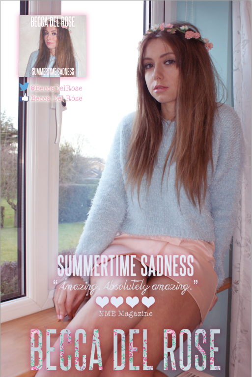

This is the first advertisement that I created. I decided to include one of the bokeh photographs as an overlay to make the image look more unique and I included conventional features such as star ratings from music magazines and Becca Del Rose's website.
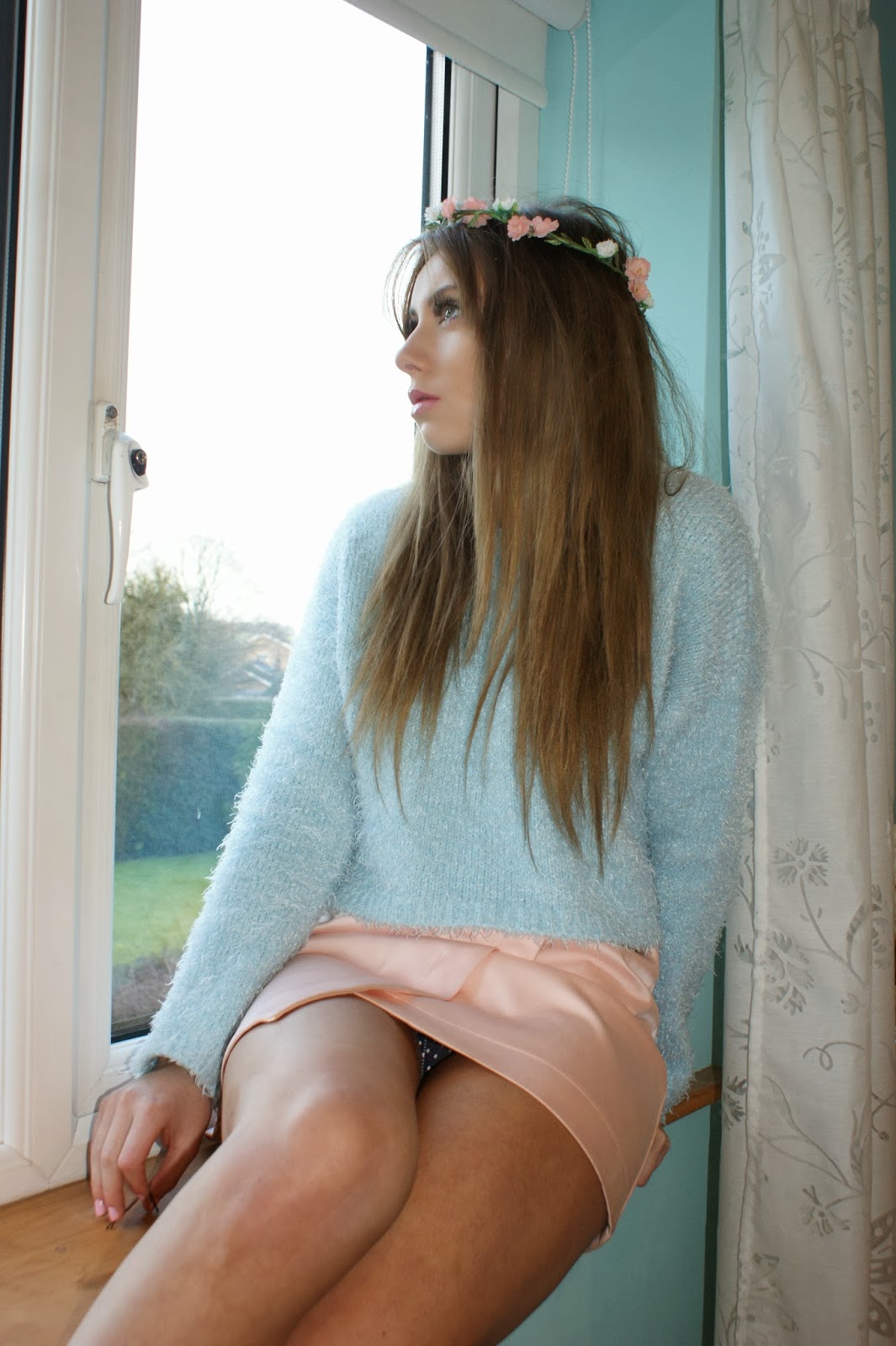
After I created the first advertisement, I decided it perhaps wasn't a good idea having the main image the same as the one I used for the digipak as it didn't showcase my skills enough. Therefore, I created another advertisement using a different photograph. However, I didn't think this photograph looked professional enough because of the plastic white windowframe, although I did like the unconventional use of hearts instead of stars for the magazine rating and the comment.
This is my third (unfinished at the minute) magazine advert. I decided to try and combine the two previous magazine adverts so that I would potentially create a mix that looks professional. I incorporated the magazine comment and the floral type from the second magazine advert, but kept the main image and layout from the first. I haven't updated the stars so that they are hearts yet, or added the Facebook or Twitter page, and I also haven't changed the digipak image to the new, updated digipak image.
As of now, I'm not sure which magazine advert I do prefer, but I will continue to improve the third one until I am happy.
Friday, 7 February 2014
(Pr) My Bokeh Photographs
In this post I talked about a photography technique called bokeh that I wanted to try. Here are a few photographs of my attempts:


Before and After
Wednesday, 5 February 2014
(Pr) First Draft of Digipak

Above is my first, uncompleted draft of my digipak. I still need to add further details to the bottom middle panel and also potentially change the pictures.
I tried to stick to the conventional features of Lana Del Rey's products, for example, the strong, determined pose as the front cover image with use of a direct gaze in order to engage with audience. I also used Del Rey's signature font (Steelfish, downloaded from Dafont) and stuck with a floral, pastel tone.
My reasons for conforming to conventions is so that the audience can easily establish who the artist is, what genre of music the artist is a part of and what the artist's ideologies are (this can be assumed through the colour scheme, the use of images, and the mise-en-scene).
Tuesday, 4 February 2014
(Pr) Photographs 2
Below are photographs taken during my second day filming.


These first two photographs are of the front cover of a Cath Kidston notebook, as I want the disk in my digipak to have a floral pattern on it.


(Pr) Deciding on the Digipak Front Cover


Above are two unfinished examples of my digipak, currently I am unsure which photograph suits the front better, although I am leaning towards the second one. I asked my fellow media students and the media technician for their opinion and the majority of people agreed and said the second image looked the best.
Subscribe to:
Posts (Atom)