Like I did last year, I've used Wix to host my evaluation as I think it allows me to show off my creativity more than just creating blog entries on each evaluation question. I've included a PowerPoint presentation, a Prezi and a video in order to make the experience more interactive and enjoyable.
Click here to be taken to my Wix website.
Alternatively, type http://elean0rgrocock.wix.com/a2-media-evaluation into your search bar.
Friday, 11 April 2014
Thursday, 10 April 2014


Tuesday, 25 March 2014
(Pr) Magazine Advert
 |
| Bokeh set to 'lighten' |
 |
| Bokeh set to 'darken' |
Whilst making the finishing touches to my magazine advertisement I decided to try out different blend types for the bokeh effect layer. On the first image, the bokeh layer is set to 'lighten', but in the second it is set to 'darken'. I decided to ask my fellow classmates which they liked better as I couldn't decide, and the majority replied that they preferred the bokeh effect when it was set to darken, but they also liked the main image when it was a bit brighter, therefore I have decided to see if I can brighten the main image so that I can keep the darker bokeh effect.

Above is my altered magazine advertisement. I've altered the brightness and contrast of the main image so that it stands out more and I've also given the main type a colour overlay so that it looks more aesthetically pleasing and also stands out from the background more. I'm still not 100% happy with this outcome, however, so I will continue to make alterations.
Thursday, 13 March 2014
(Pr) Digipak Feedback
In order to best judge my digipak and in order to gather the best audience feedback, I printed out my digipak and folded it up so that it resembled the real thing. I then asked my fellow classmates what they thought about it and what improvements could be made, this is what they said:
Improvements to be made:
- The colour of the main type on the front cover doesn't stand out enough
Positives:
- The disc design looks effective
- The continuity of the product is effective (the colour scheme, the typography)
- The use of a variety of images


Friday, 21 February 2014
(Pr) First Draft
Above is the first draft of my music video. There's some parts I'm still not 100% happy with, and I'm not really pleased with the video quality, although I'm not sure if I'd be able to change this at all as I've already tried a couple of different things in an attempt to make the picture clearer and nothing has altered.
Thursday, 20 February 2014
(Pr) Magazine Adverts
So far I have created three potential magazine adverts for my digipak. My reason for creating three is so that I can compare each one and then create the best advertisement possible.


This is the first advertisement that I created. I decided to include one of the bokeh photographs as an overlay to make the image look more unique and I included conventional features such as star ratings from music magazines and Becca Del Rose's website.
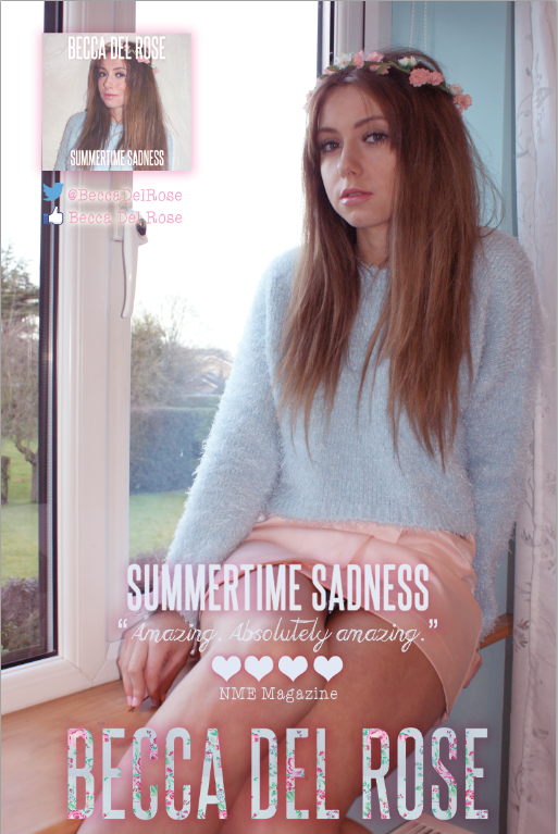
After I created the first advertisement, I decided it perhaps wasn't a good idea having the main image the same as the one I used for the digipak as it didn't showcase my skills enough. Therefore, I created another advertisement using a different photograph. However, I didn't think this photograph looked professional enough because of the plastic white windowframe, although I did like the unconventional use of hearts instead of stars for the magazine rating and the comment.
This is my third (unfinished at the minute) magazine advert. I decided to try and combine the two previous magazine adverts so that I would potentially create a mix that looks professional. I incorporated the magazine comment and the floral type from the second magazine advert, but kept the main image and layout from the first. I haven't updated the stars so that they are hearts yet, or added the Facebook or Twitter page, and I also haven't changed the digipak image to the new, updated digipak image.
As of now, I'm not sure which magazine advert I do prefer, but I will continue to improve the third one until I am happy.
Friday, 7 February 2014
(Pr) My Bokeh Photographs
In this post I talked about a photography technique called bokeh that I wanted to try. Here are a few photographs of my attempts:


Before and After
Wednesday, 5 February 2014
(Pr) First Draft of Digipak

Above is my first, uncompleted draft of my digipak. I still need to add further details to the bottom middle panel and also potentially change the pictures.
I tried to stick to the conventional features of Lana Del Rey's products, for example, the strong, determined pose as the front cover image with use of a direct gaze in order to engage with audience. I also used Del Rey's signature font (Steelfish, downloaded from Dafont) and stuck with a floral, pastel tone.
My reasons for conforming to conventions is so that the audience can easily establish who the artist is, what genre of music the artist is a part of and what the artist's ideologies are (this can be assumed through the colour scheme, the use of images, and the mise-en-scene).
Subscribe to:
Comments (Atom)